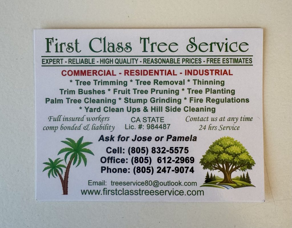
“I find these local business cards and ads super inspiring.
Basic graphics that make perfect sense—no fancy layout techniques or unnecessary colors.
It’s typography people can relate to:
no marketing language, dense with information, and just the clear facts.
No exaggerations. No “I’m not sure I get what they do” feelings.
I know exactly what they do. I know exactly how to get in touch with them. I even know their first names.
This is 100x better than almost every modern website. Designers can learn a lot from this “not-designed-by-a-designer” design.
It’s outstanding. Bravo.”
– Jason Fried (Co-Founder, Basecamp)
Another Example:
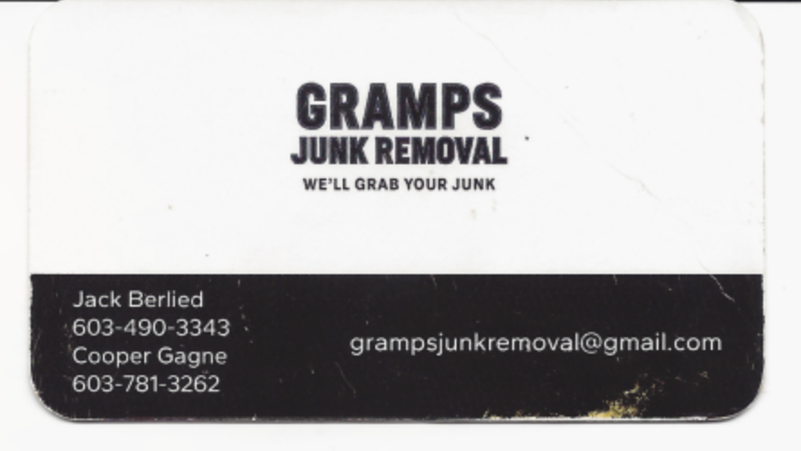
Richard Thomas Jr: I found this great example at a gas station on my way to New Hampshire last month. Simple. Clear description of the service they provide: